IA case study: a concept mapping approach to identity design
Much has been written about concept mapping and identity design. But since this is an area where creativity and science blend together, and since I’m always looking for new concept mapping ideas myself, I thought I’d share this old project as a case study.
The whole process behind concept mapping intends to create a context for subjective words and ideas that that have meaning for the client. The organizing principle must be comfortable and accessible to the client. There is no right way or wrong way to do this, so there are any number of paradigms the consultant can use to approach this exercise. Some clients are comfortable with a “softer” approach, while others require a harder “business-oriented” look and feel to the exercise. I have worked with information architects and designers who have done some wonderfully interesting concept maps, tying business and marketing requirements to the visual design brief. There are different approaches and much depends on the client’s needs, who are the stakeholders involved, the budget and design resources available. The case discussed here was done in two phases: the concept map was drawn up in-house with the consultant, then several design firms were hired to create sample treatments based on the concept paper and a design brief. The designers whose treatments resonated most with the client were chosen to work on the final product.
In this case the client was a nonprofit organization and preferred a naturalistic “soft” approach because its mission-oriented stakeholders were comfortable with that kind of narrative quality. Eventually we numerized some metrics to reinforce the business drivers behind the branding and organizational development work that the organization was trying to accomplish.
Lightstone Community Development Corporation was a non-profit organization working in the rural mountain communities of West Virginia and Appalachian Virginia. The organization’s mission focuses on sustainable economic development in rural farming communities, and their programs depend upon community-based partnerships throughout their extended service area. While navigating an intense period of growth and change, Lightstone needed a professionally developed identity to replace its homegrown start-up ID. We worked with the CEO, board, and staff to address key elements of its mission and current brand awareness.
As a starting point, we listed a number of relevant or evocative words and phrases into four quadrants of Classical thought: “Water”, “Earth”, “Fire”, and “Community” (this, instead of the traditional “Air”, seemed to get more at the spirit of Lightstone’s evolving direction). After noticing that several of these words seemed relevant in more than one quadrant (in bold), we decided to list the words in a spreadsheet and give them a score or weight in each of the four categories. We were searching (hoping) for several outcomes:
• A matrix of related concepts and words.
• A crossroads of emotive and mission-oriented thoughts.
• 5 keywords from this context to inform the design brief.
The following chart shows the four quadrants with their associated words, along with a nautilus shell representing the Fibonacci series, which was a recurring theme for the client representing natural non-linear evolution and growth.
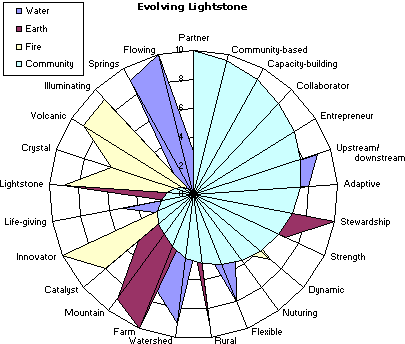
Next, we started trying to graph the relationships based on the weight or score of each word/phrase in the several categories. We settled on a radar-type graph with the most weight given to the “Community” quadrant as a way of tying together all the words in a community-based context. Having started with a more objective scoring, we then backed all the scores out based on a more personal relevance to Lightstone’s mission and position in the community. Some words have less of a score in the “Community” category, but they are important to Lightstone — these words hit the outside of the graph, while still having some score in the “Community” category. This was done in Excel using the radar graph format. With a bit of creative tweaking we actually were able to put all the terms in a graph that resembled a nautilus shell. The client was ecstatic and it really got the creative juices flowing:
Here is our new Nautilus!
Here are the five highest-scoring words/phrases — very human, forward-thinking, dynamic (or fluid — “Flowing” and “Innovator” score highly in different sectors, but both embrace change and growth), and very appropriate for this client:
| Water | Earth | Fire | Community | |
| Partner | 3 | 0 | 0 | 10 |
| Stewardship | 2 | 10 | 0 | 6.99 |
| Farm | 7 | 10 | 0 | 3.9 |
| Innovator | 3 | 2 | 10 | 2.8 |
| Flowing | 10 | 0 | 0 | 0 |
A design brief was prepared based on the concept map and narrative quality of the exercise. The graphic design process is often mysterious to the client, who knows intuitively what they like and don’t like, but who is often uncomfortable with how or why the process works. Because designers work with evocative and emotive images, type-faces and relationships, the concept map helps the client to navigate an otherwise “fuzzy” area. We have been fortunate to work with several excellent design firms, and to be able to facilitate the process with the client for a successful outcome. Although several design firms offered wonderful treatments, the final identity was quite outstanding.
This is the resulting corporate logo for Lightstone.
This article originally published in Patterns, the former journal of the Human Systems Dynamics Institute


