Social cartography: mapping the social network
Being a good story teller is one half of being part of a productive conversation… being a good listener is the other half. The same is true when it comes to social media monitoring and engagement. Listening to the social media conversation means investing the time and resources into metrics, monitoring and analysis. Being a good listener means putting a little extra effort and thought into this process. A good listener is valuable to any conversation, and it’s no different in social media. Being a good listener helps brands and organizations to understand their networks and get a higher return on their investment in social media. Everyone recognizes a good listener in the conversation.
In order to understand how social networks work, and get beyond the simple marketing stats, analysis needs to go beyond Web metrics and be more proactive. Network analysis must be part of the strategy going forward. There are several software tools that can be used for this kind of analysis. Microsoft NodeXL was used in the example below. Network analysis is useful to help direct social media efforts and prioritize resources.
According to Hunter Whitney in his article “Social seen: analyzing and visualizing data from social networks” (UX Magazine, December 15th 2010):
“[…] Data visualization techniques can reveal interesting patterns in online crowds and communities, and can tease out layers of rich and detailed information about them. Marc Smith, Chief Social Scientist for the Connected Action Consulting Group and a co-author of Analyzing Social Media Networks with NodeXL, says the “shape of a crowd”—its physical arrangement, along with its, movements, and context—can reveal a lot of interesting information […]” Smith says, “This is a kind of social landscape, and this landscape has peaks (people who can be the most popular), valleys (the more peripheral people in a network), and bridges (the people who are essential connecting points in a network). Social cartographers are defining the meaning of the map.”
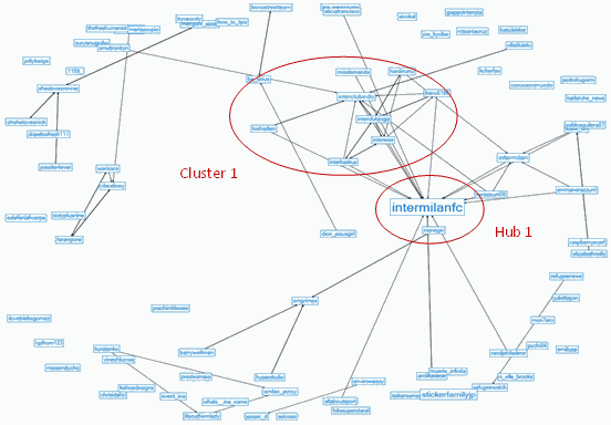
A network graph of a sample of 100 Twitter users who Tweeted the term “unicef” at 2:30pm on 17 February, 2011. The red circles indicate possible tiers of influence and “alpha users” (including high velocity posters). These are influencers, gate keepers and bridges across the larger social network. Regular analysis of the network connections organized around key terms, and networks of UNICEF’s global followers is key to identifying trends, important topical connections and potential influential distribution partners in the network. This can be very useful for making a selective “@ list” for Twitter engagement as part of an organizations social media engagement.
This graph follows a pattern typical of social networks and neural networks, or “small world” networks, leaving most connections in narrow proximity around the outside of the circle, while a smaller number of nodes make farther reaching connections. For example, the user “intermilanfc” (Hub 1) had 44,562 followers at the time of this sampling and followed 10,120 other Twitter users, thereby creating a network distribution hub. Engaging this user in conversation could yield very productive results.
The group labeled “Cluster 1” is a cluster of highly interconnected users who are also connected to Hub 1, but are themselves aggregated around a common interest in the term “unicef”. Clusters of users represent content consumers who self-organize around a common concept or keyword. Identifying clusters and their interests is one good way to find which concepts and keywords have an audience at a more granular level. This information can be leveraged through intelligent and regular use of #hashtags and keywords, better enabling content to be found by interested content consumers.
